Trustaid
I served as the Lead Designer for the redesign of the TurboAid website, which our team renamed and rebranded as TrustAid. Our client, Jeff, had a successful analog service assisting college-bound students in determining how much financial aid they could expect to receive from prospective schools. Our challenge was finding a user-friendly way to translate his business into a digital platform.
UXUI
Mobile platform
The challenge
The trusted website failed to communicate their value proposition in a clear way. Their site was overwhelmed with features and inconsistent call to action.
Research
RESEARCH GOALS
Who is the TurboAid user and how do they typically go about discovering how much financial aid to expect from colleges?
What are users’ pain points with the current TurboAid website?
What value did Jeff’s past clients find in his analog service, and how can that value be translated to a digital platform?
What are competitors doing that TurboAid can do better?
RESEARCH TOOLS
Heuristic Evaluation
User Interviews
User Surveys
Usability Testing
Market Research
Competitive and Comparative Analysis
KEY RESEARCH INSIGHTS
Users can be students and/or parents.
Users are unaware that estimating their financial aid is a possibility, but would like to be able to.
Currently, users typically apply to school, and “figure out” the cost later.
Jeff’s past clients valued the personable nature of his analog service.
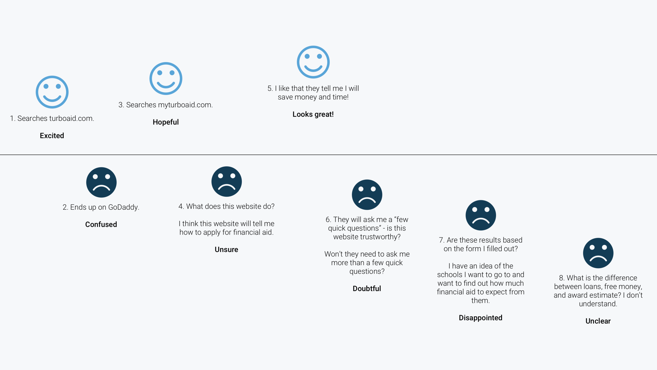
Users are not sure what the current TurboAid website will allow them to do, and get lost in the flow.
STRATEGY + IDEATION
USER PERSONA
AMANDA'S JOURNEY MAP (PRE-REDESIGN)
KEY STRATEGIC DESIGN SOLUTIONS
Reconfigure the "school result card" so that users are better able to understand the relationship between “free money”, “loans”, and “financial aid.”
Implement a result terminology legend for users to reference in the event that they don’t understand the terms used.
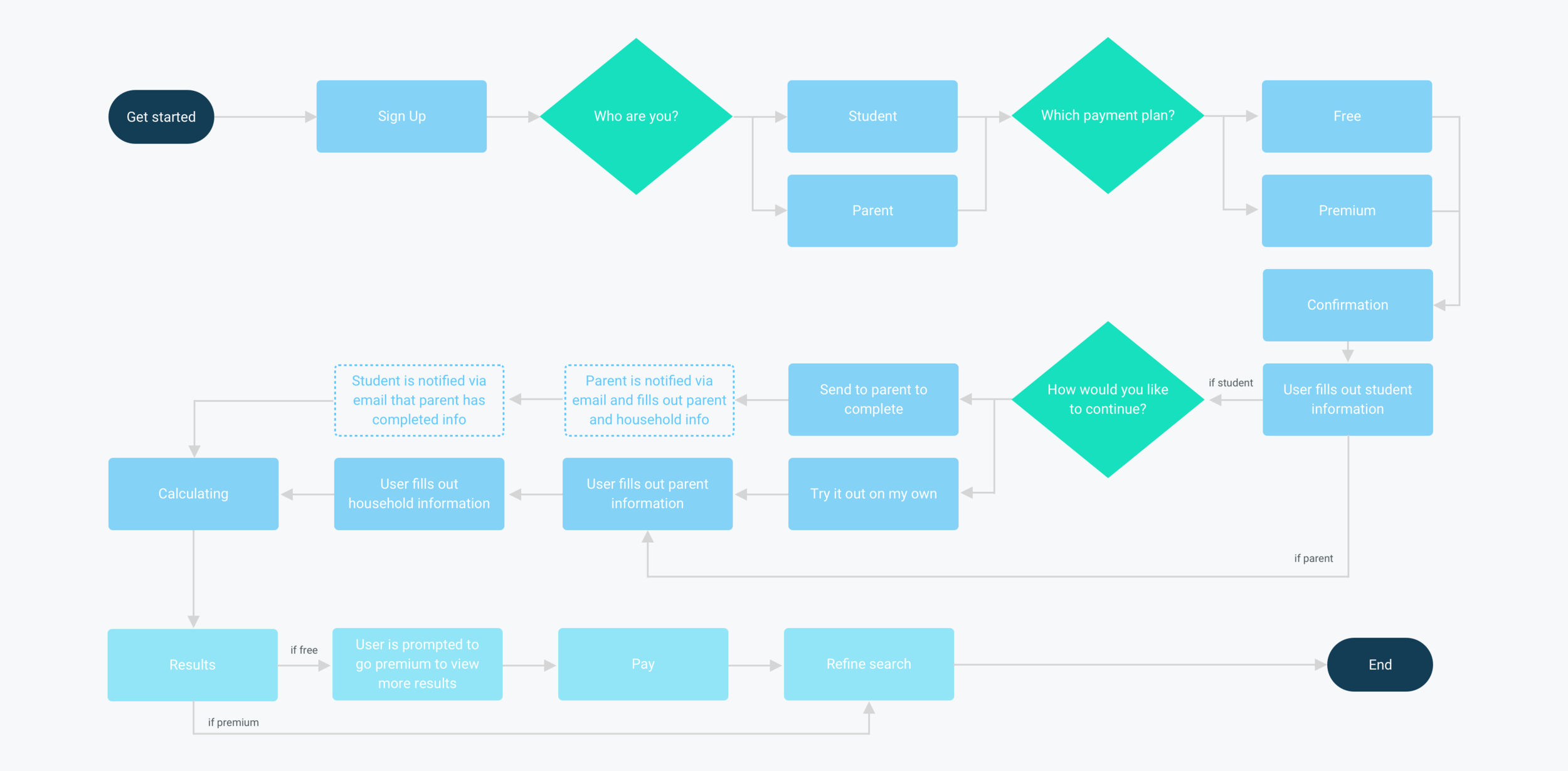
Redesign the form so users receive one question at a time, and receive confirmation when their information has been submitted and auto-saved.
Add in tooltips beside each question, so users can easily access additional information about each question.
Personable language and user-tailored questions.
Simplify the navigation.


