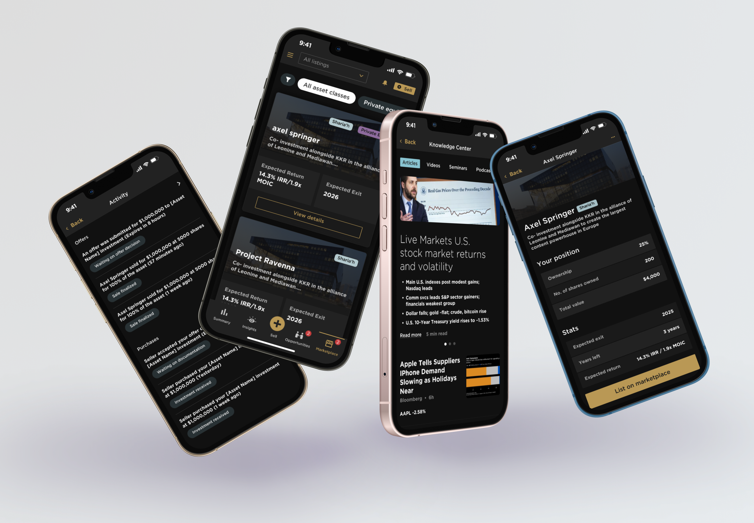
Secondary Markets Feature
Case Study
UX Research | UI Design
Deliverables
UX Research
iOs UI Design
iOs Developer Handoff
Industry
Fintech
Timeline
Start: November 2022
End: December 2022
Overview
The Family Office (TFO) wanted to expand their current offering for digital wealth management. The Secondary Markets feature was a new addition to their existing “client app”. It’s objective was to make acquiring and selling private equity on the secondary marketplace accessible to their clients.
Background
TFO is an independent wealth management firm serving some of the wealthiest families, individuals and investors in the The Gulf Cooperation Council (GCC). They brought in UX Cabin to help manage the UX process and build new applications across their digital product line.
Strategy
Understand the user’s sensibilities, desires, and core business goals
Create efficient flows to help users get tasks done without much handholding
Provide customized investing plans and opportunities for individual clients
Objectives
Create a premium experience for their clientele to buy and sell deal
Integrate the application into an existing product called, The Client App
Emphasize privacy and security to reassure users
Design
The primary objective of the design was to make it as easy as possible for TFO clients to list their existing assets into the secondary marketplace. For this reason, what was once originally scoped as a separate product instead became an extension of an existing application called “The Client App”.
In the end, the Secondary Markets feature consisted of a new page called the “marketplace”. Here, clients could either list their own private equity assets or browse available listings. Clients were able to submit private bids to deal owners. If accepted, a buying process would initiate and be facilitated by the TFO accounts team.
Principles
Premium, luxurious appearance
Informational UI
Progressive revelation
Clear, digestible information
Process
The team, consisting of me and two other Product Designers, worked in tandem with an independent UX Researcher and the TFO stakeholder team to gather requirements, review mockups and prototypes, and conduct usability tests with TFO users.
Product discovery
Before starting development, we set out to understand what the users' problems and needs were, then validated our ideas for solutions. To do that we needed to know the 3Ws - Why, Who, and What. This helped us to decide what features to build and prioritize and helped set up the product for excellence.
The team also kept a living document that outlined the designed goals and outcomes of the new initiative and tied customer pain points, technological constraints, and suggested solutions.
Site map and user flows
With site maps and user flows, we were able to get a bird’s eye view of the application which allowed us to get a feel of the size and complexity, and how users will go from point A to point B efficiently.
Wireframes
Once we had the sitemap and user flow, we proceeded to the wireframe phase to flesh out the blueprint of the site’s structure, layout and functions, which gave us a clear idea of the UX design functions.
High Fidelity Designs
We proceeded to make high fidelity designs once low-fi wireframes were fleshed out and approved by stakeholders.
Developer Handoff
We worked tirelessly to communicate each screen and feature explicitly so that it took out all guesswork from developers.
This included:
Dev notes
Release comments
Explanation of functionality
Links to user stories


